Community Quilt 107

2 10 2013

This was one HUGE quilt! I reckon it took me well over 12 hours to quilt.

First, I stitched ESS (‘every stinkin’ seam) around all the blocks to stabilise it. Then I tackled one block at a time, deciding how to quilt it, then selecting thread colours, then doing the quilting. Some of the quilting is VERY dense and took ages.

I’m not going to attempt to document the threads I used as there were so many, and as I did this quilt over a couple of weekends, with a week-long trip to Bali in between 😉 There’s no way I remember what I used!

(Click on a photo to view it larger.)

quilt107_01

quilt107_12

quilt107_11

quilt107_10

quilt107_09

quilt107_08

This photo isn’t as good as I would’ve liked… The bubbles (baubles?) in the Christmas tree are all stitched in gold metallic thread and shine brightly 😉

quilt107_07

Yes, I stitched every second row of that checkered fabric, vertically and horizontally…

quilt107_06

I stitched the centre flowers in the stars in gold metallic thread and really liked the effect

quilt107_05

Another one where I stitched every single cross-hatch in the fabric…

quilt107_04

quilt107_03

quilt107_02

I really like McTavishing, but it uses an incredible amount of thread and takes a long time, so I tend to only do it in small areas, like the background of this tulip block. To make the tulip ‘pop’ even more, I echo stitched about a quarter inch from it before dong the McTavishing.

quilt107_15

I used a gingko leaf motif in the background. I hadn’t stitched that design in ages — I should use it more often as it’s a great filler.

quilt107_14

I wasn’t sure what to do in the border as this quilt had a LOT of quilting. So I decided to do large ‘petals’ with a smaller inner petal (or flame), and then once I’d finished all around the quilt, I went back and echo stitched around them all. I quite liked the final effect.

quilt107_13


2013 Challenge

26 09 2013

Last weekend was my annual quilt retreat weekend with ‘the girls’. This year Michelle set our challenge — an abstract of one of the five senses. The sense I picked out of the hat was taste; the others selected one of the other four senses at random.

I’m continually blown away by the creativity of my friends when we do these annual challenges, and this year was no exception. Here’s how we interpreted (in abstract) our selected sense… (Click on a photo to view it larger.)

Michelle: Smell

Michelle titled her art quilt ‘Odiferous’ (aka ‘Whiffy Wafts’!), with the hombre (?) fabrics graduating from small whiffs to full on wafting smells. I love how she used the graduated light to dark grey fabrics in the border especially, and the graduated coloured fabrics for the wafts. And her quilting was to die for — so small and detailed! The entire quilt is about 30×36″, so it’s not big.

IMAG1189

Glenys: Sight

Glenys knew what she wanted to do as soon as she got her challenge last year 😉 Sight = eyes = optical illusions, so she created this stunning — and big — black and white quilt that changes shape as you look at it from different angles. at times, the centre pops like a big orb, and from other angles, you can see a huge ‘X’. But the reality is that it’s all an illusion — every black and white block is the same size and shape. The illusions are created by the placement of the small appliqued black and white squares in the centre blocks.

IMAG1136

Flora: Hearing

Flora had lots of discussions with her husband and grandsons on how to approach her selected sense: ‘hearing’. Her grandsons were keen on her doing something with music, particularly guitars. Flora’s an embroiderer so she added quite a bit of hand stitching and small and large beads as embellishments to her lovely guitar-themed art quilt, which is based on Robbi Joy Eklow‘s style of abstracting objects such as guitars.

IMAG1182

Bobbie: Touch

Bobbie blindfolded us (thanks Qantas for all those eye masks I’ve kept over the years ;-)) and got us to come up to her big cutting table where we had to feel different parts of her quilt (certain bits stuck out, were soft, hard, feathery etc.). As with many of her quilts, her inspiration was the earth and the seasons. Her tree limbs are feet digging into the ground and hands reaching for the sky, and she incorporated aspects of all of nature’s seasons going around the quilt. She machine embroidered the apple blossoms and the snowflakes (?), and the texture in the summer and autumn leaves comes from the batik fabrics she used for them. Her quilting for each season and sky/earth aspect reflects that season or element of nature. This is a large quilt and now has pride of place in Bobbie’s entry hall!

IMAG1183

IMAG1184

IMAG1185

Rhonda: Taste

I also blindfolded the girls, then fed them small pieces of citrus fruits — lemon, lime, grapefruit, and orange — to see if they could distinguish between sour, bitter and sweet. Most spat out the lime, lemon, and grapefruit and were glad that a piece of sweet orange was at the bottom of the bowl I’d given them 😉 Once they’d removed their blindfolds, I revealed my piece, which I’d mounted on black batting on a portable design wall. I got lots of ‘ooos’ and ‘ahhhs’ and some ‘OMGs!!’, with Michelle saying that I MUST MUST enter this piece in next year’s QuiltWest. Each panel is about 15×21″(details on the process for creating this piece start here: https://rhondabracey.com/2013/09/20/2013-challenge-coming-to-a-decision/)

IMG_5091

IMAG1177

IMAG1178

IMAG1179

IMAG1180

And then the reveal was all over for another year. We’re taking a break from a formal challenge in 2014 — three of us are still working and two in particular are finding it hard to complete the challenge in amongst life, work, family and all sorts of other commitments.

However, our ‘challenge’ for 2014 is to come up with at least three challenge themes each to go into a hat for future years. We’ve now been doing the challenge and retreat at Bobbie’s beautiful house for five years, so we’ve each had a go at setting a challenge. I know I’ve learned an awful lot by pushing and extending myself in these challenges, and I’m sure the others have too.

Finally, one of the things we do on the evening that we do the reveal is have ‘show and tell’ of some of the other things we’ve worked on during the year, so these next photos are from ‘show and tell’. Mine aren’t included as I couldn’t take photos as well! If I get photos of mine from the others, I’ll add them later.

IMAG1151

Bobbie’s blue and white double wedding ring quilt that she started in 2012 — all finished!

IMAG1153

Glenys’ cat quilt, also started in 2012

IMAG1154

One of the quilts Glenys made for her shop to feature some of the new Halloween fabrics. Just love that owl!

IMAG1155

Another that Glenys made for her shop featuring hexagons in a particular fabric range

IMAG1159

One of Gleny’s staff made this hexagon quilt. Heaven knows how she did that binding!

IMAG1193

This was a community quilt I worked on over the weekend. I took the photo to show the effect that quilting has on a quilt — it was quite plain with just ‘stitch in the ditch’ as you can see in the area of the lower right, so the community quilt ladies asked me to liven it up a bit.

IMAG1187

One of the pieces Michelle worked on during the weekend — this will be a banner for her shop’s stand at craft/quilt fairs. One of her staff did the centre applique work — Michelle did the stunning quilting in just a couple of hours on Bobbie’s Sweet Sixteen.


2013 Challenge: The finished product

20 09 2013

I tried out a couple of arrangements of the four pieces on the black background. I think I like the side-by-side arrangement best, with some black showing through.

When we have the retreat, I’ll try to take some better photos on a solid wall 😉 These ones were taken in my sewing room and I was making do with what I had to display them, so everything is at a bit of an angle and I was using my phone’s camera, not a proper camera.

Meantime, I sent these photos to a quilting friend in Oklahoma, and her first reaction was ‘Citrus Explosion’ — I loved the name so that’s what this series is now called.

Update May 2014: I’ve had this quilt valued, and the certificate of valuation is below. However, the valuation only takes account the materials and techniques used and the quality of both — it takes no account of the time to learn the techniques nor the time taken to make the piece, which can be hundreds of hours.

Update September 2014: This piece featured in Down Under Quilts magazine (Issue 166, 2014), on both the editorial page and p62 in the feature on QuiltWest. Scans on those pages are below the valuation certificate.

IMAG1078

IMAG1079

IMAG1080

IMAG1081

IMAG1082

IMAG1083

_Valuation 2014_Citrus_explosion

Featured in Down Under Quilts magazine (Issue 166, September 2014):

down_under_quilts_iss166_editorial

down_under_quilts_iss166_p62

See also:


2013 Challenge: The process

20 09 2013

I wanted the finished citrus piece to be quite large so I printed it across four pages on my printer, then cut the white off the edges and taped all pages together.

Next, I taped it to my sliding glass door so I had a ‘light box’ for tracing.

01_trace_design

I traced the pattern onto tracing fabric, but realised that I didn’t need this at all, so that was a waste of time!

02_trace_design

I then traced the pattern again, but this time directly on to the top fabric of the two pieces of fabric.

03_trace_design

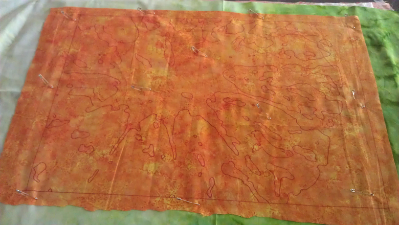
Next step was to layer the top fabric (with the traced outlines) onto the background fabric (right side up), batting, and backing fabric (right side down), and pinning it all together to create a quilt sandwich.

04_layout_fabric_layers

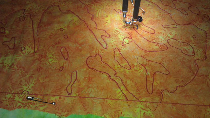
Stitching on the traced lines through all layers was next.

04a_stitch_all_layers

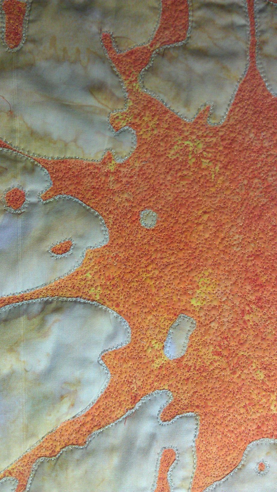
Then came the very delicate cutting process — delicate because I had to be careful to cut the correct pieces out otherwise it would look odd! I use applique scissors and really sharp-tipped embroidery scissors to cut close to the stitched lines.

05_orange

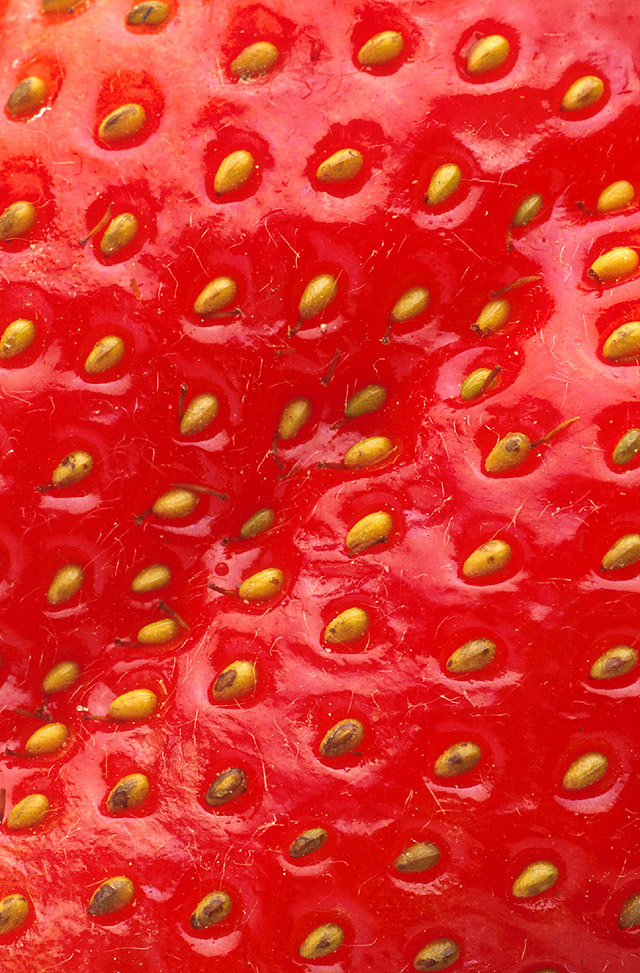
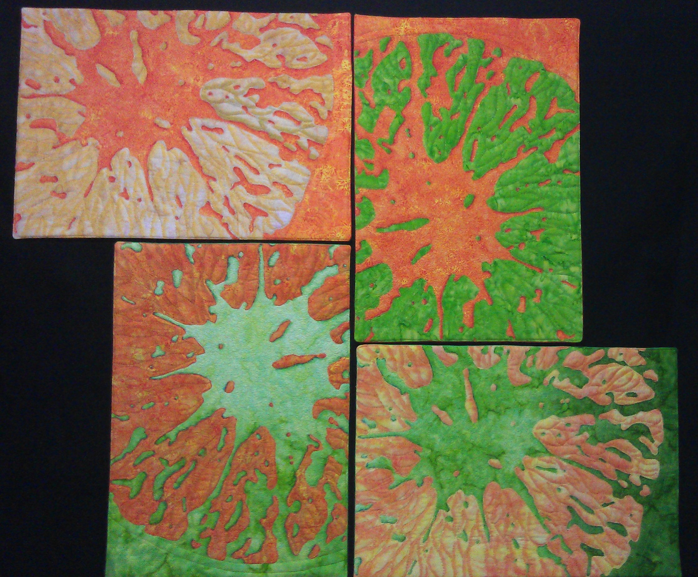
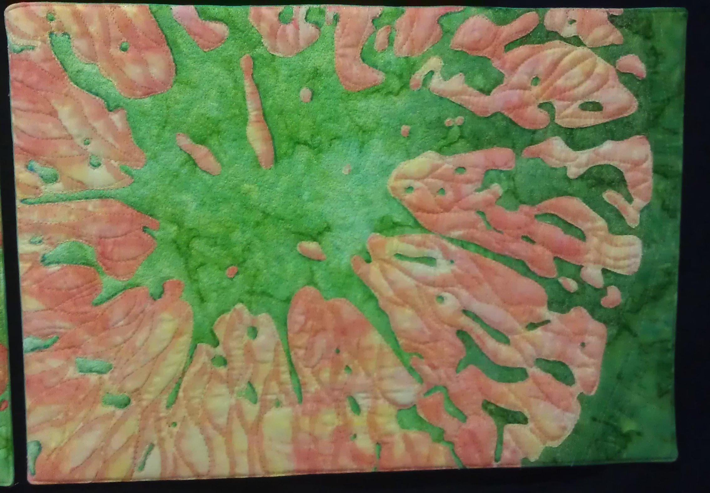
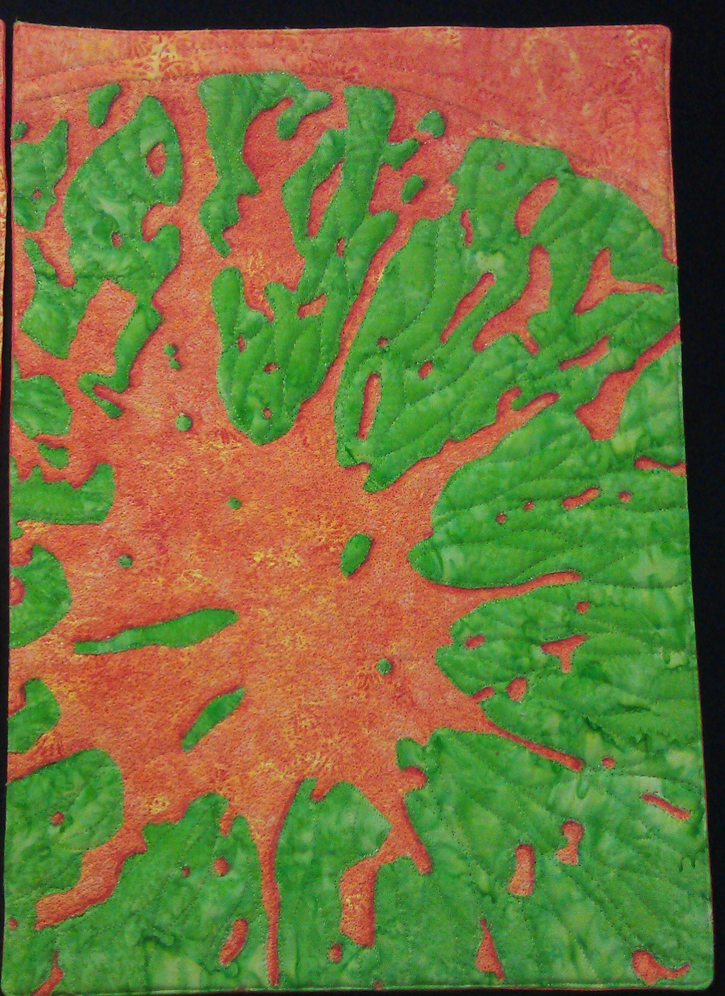
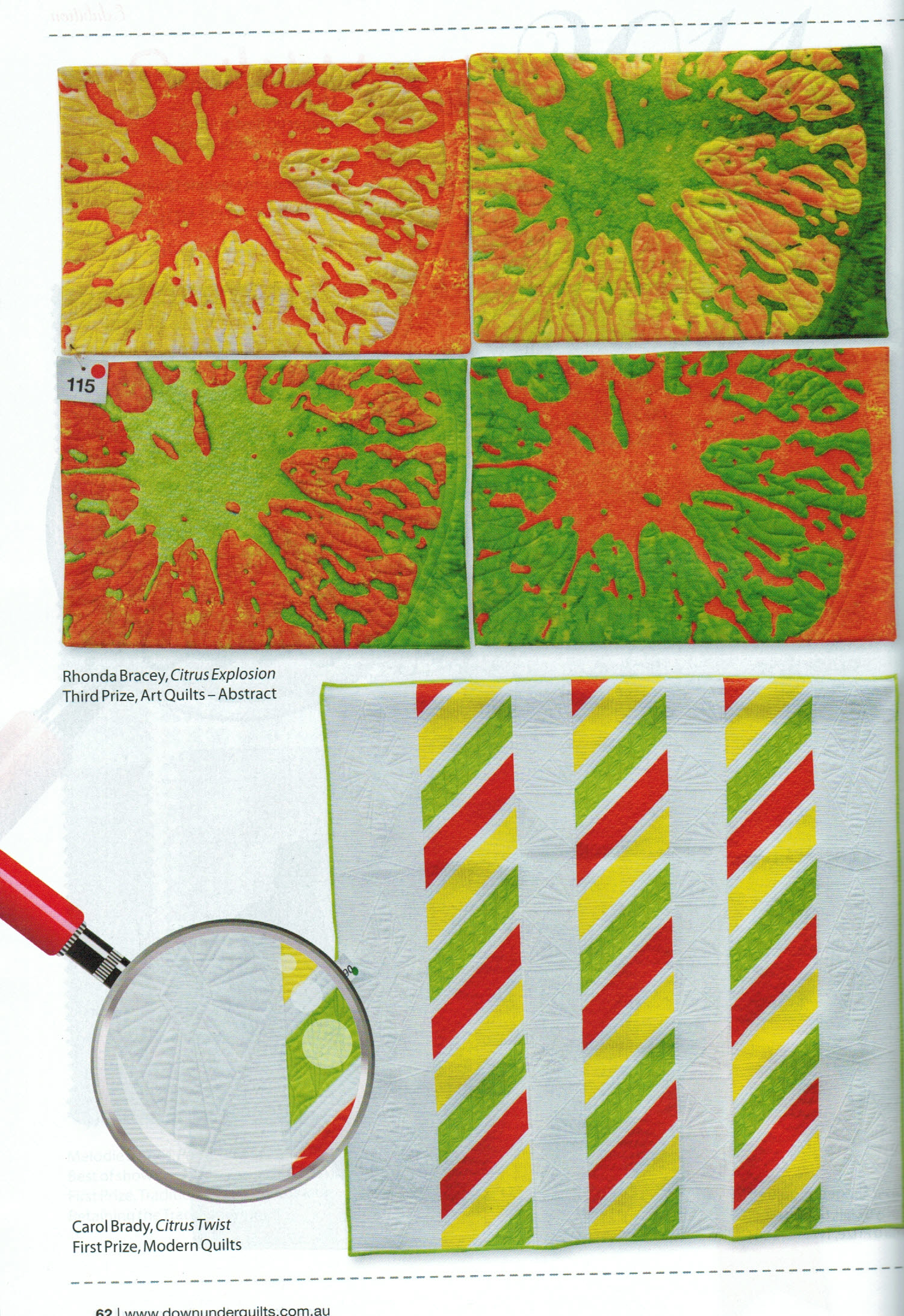
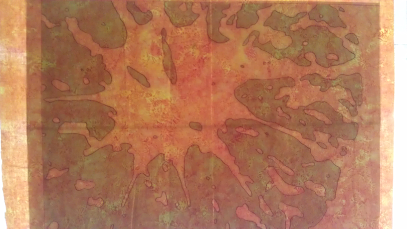
I really liked the result of the first one, so I decided to do three more! I was thinking along the lines of Andy Warhol’s ‘Marilyn Monroe’ series…

Each one represents a different fruit — orange, lemon, lime, and pink grapefruit.

06_lemon

07_lime

07_grapefruit

However, I’m not happy with the pink grapefruit one as I think the colourway is too different from the others. So I think the one I had designated as lemon will become an ordinary grapefruit, and I’ll do another one with yellower fabric for the lemon.

So that’s where I’m at as at mid-April 2013.

Of course, my brain is now contemplating how I’m going to display these four — perhaps five — pieces. Should I mount them on black — if so, in linear or offset formations? Should I add hanging tabs and slip a dowel through them to make them single items in a line united with a common theme? Should I cut them up and join them back together in different combinations? Or something else? Should I bind them or face them? So many more decisions….

They already have batting and backing, so I may be limited in how much I can do with them.

And of course, I still have to stitch down the raw edge applique so it doesn’t pull apart and quilt each piece more densely. And perhaps add fabric paint/markers too… Decisions, decisions…

No matter what I do, already more than 80 hours has gone into these pieces to get to where they are now, of which about 20 hours was the making to this point.

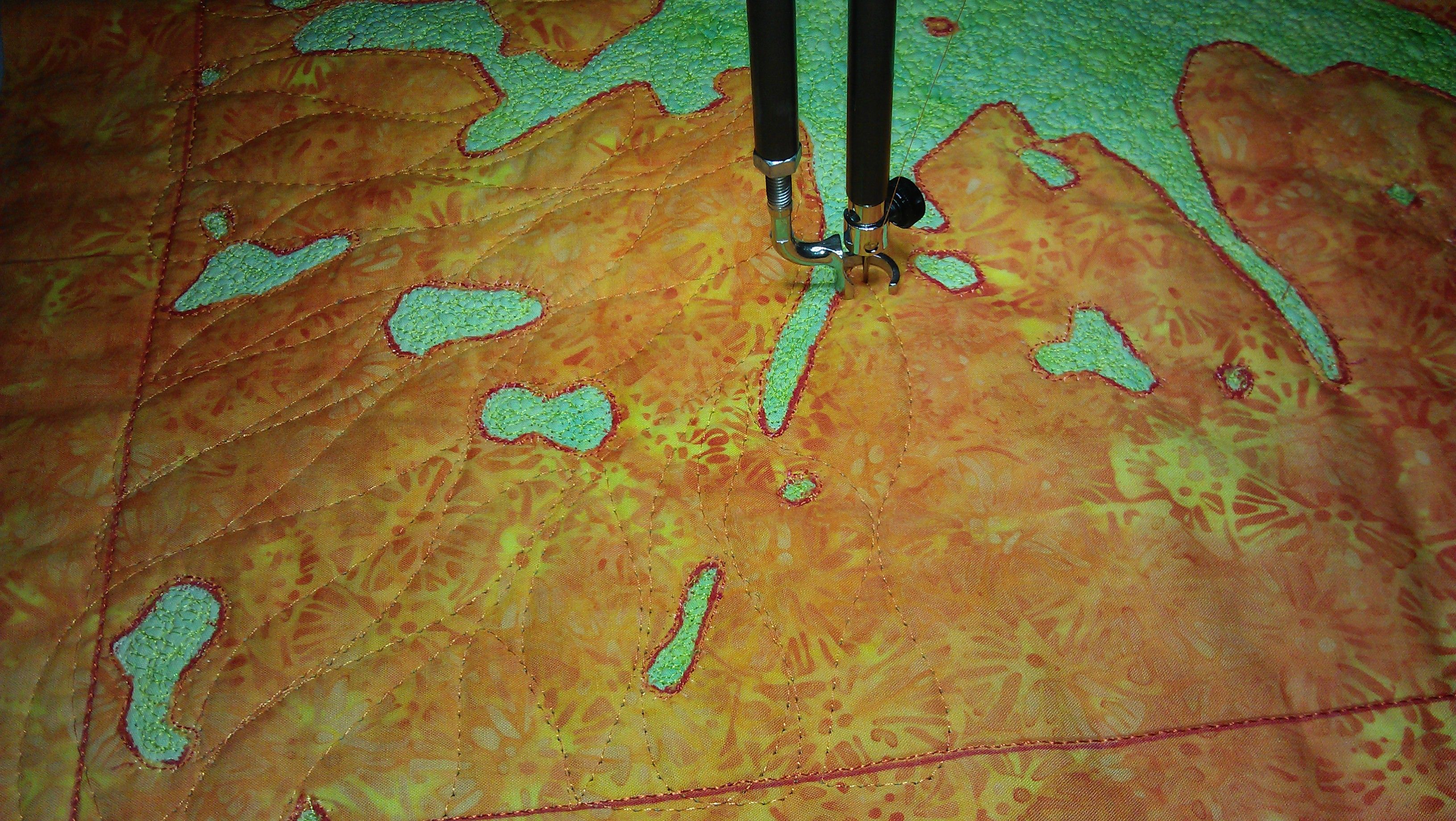
Update late April: I’ve now found fabric for the lemon piece and done that one. I’ve also scribble stitched the centres of all four pieces (I’m now using the pink one as my tester). That scribble stitching took HOURS and some 35,000 stitches EACH — just for the centres. But I do like the effect.

lemon

scribble_stitch

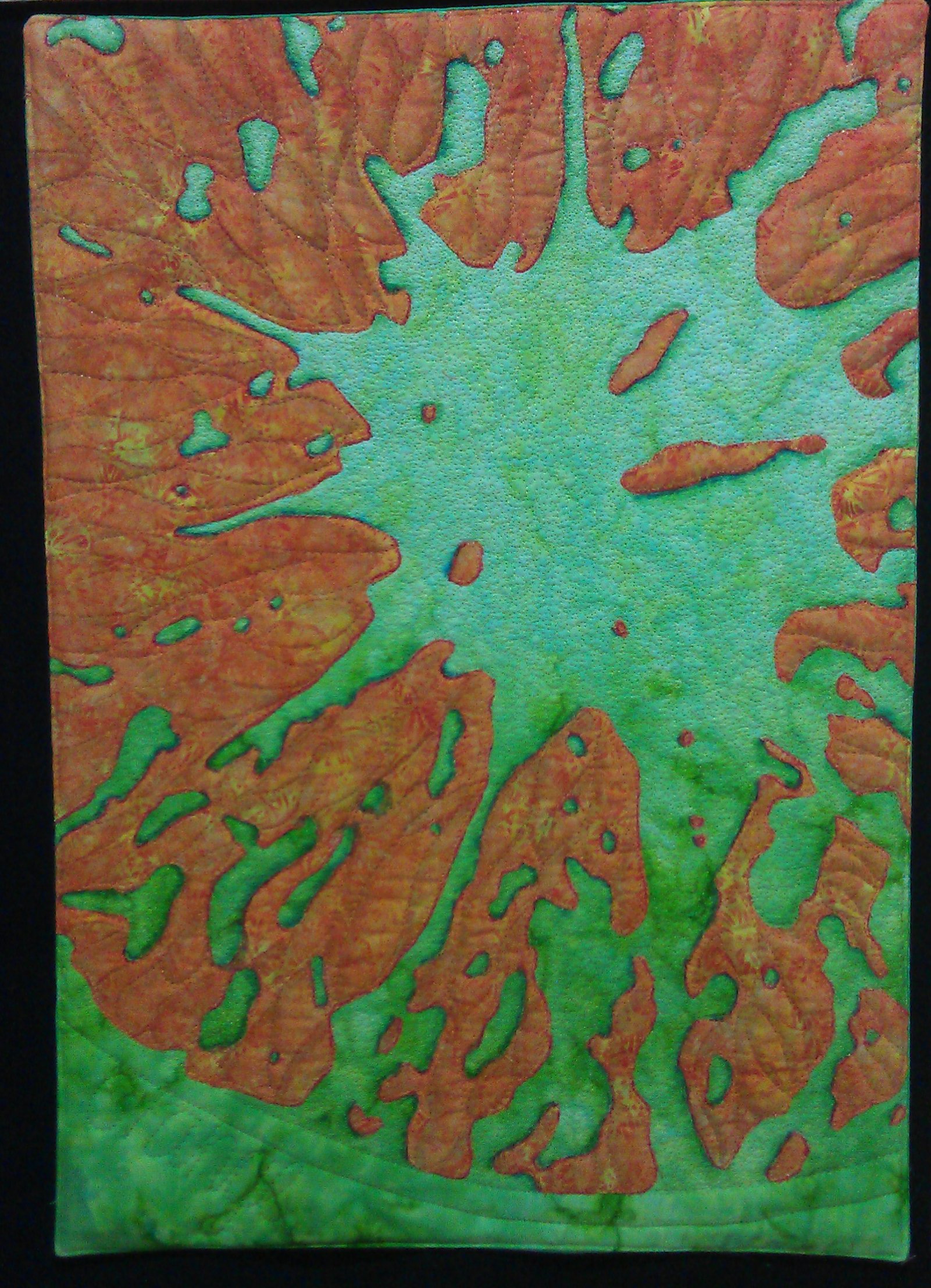
Update mid-May 2013: The next step was to quilt the segments. My initial attempts were too tight and small, so I opted for a larger, free-flowing wavy stitch in the same colour as the fruit. I quite liked the effect.

globules

The next big decision is how to mount/display these quilts, and whether to use all five or just four of them in the final piece. That decision will affect how I bind them, or whether I do a curved piece for one edge, whether I do a faced binding, or a piped binding or something else. I’m going to wait a while on that decision — the Craft Fair in Perth in a couple of weeks time has a short workshop/demo I hope to attend on alternatives for finishing quilts, and maybe I’ll get inspiration from that, or from the quilts I see on display at the QuiltWest exhibition.

Update June 2013: I wanted to emphasise the segments a bit more — give them some depth using shadows, so I got out my Copic markers (I bought 20 more at the Craft Fair!) and tested various colours on scraps of the various fabrics I’d used for the citrus pieces. Then I spent a whole afternoon adding shadows. I didn’t want to go too dark initially, as the marker ink seemed to want to have an edge even though I used the brush tip and a feather stroke from the stitching line into the segment. I might add a tad more dark, perhaps with the Inktense watercolour pencils I have.

I also decided to finish the pieces by making a full facing, a la a pillowslip, but sewing down the opening. And I wanted to add some body, so I cut large pieces of Floriani Stitch and Shape (single sided fusible) about half and inch smaller all round than the outer stitching line, then fused it to the back of the piece.

Then I cut pieces of plain green and orange fabric for my backing fabric, making sure they were about one inch wider all round than the Stitch and Shape. Before stitching the backing pieces to the main sandwiches, I stitched on four Velcro hook pieces onto the right side of each piece of backing fabric so that I had the option to ‘hang’ these pieces onto a carpet/fabric display board, or similar.

I placed the backing fabric right side up, then placed the quilt sandwich (with the Stitch and Shape fused to it) right side down, checking that each side had sufficient backing fabric overlap, then pinned the layers together, leaving about 6″ on the ‘cleanest’ side for the opening.

Next I stitched about 1/8″ out from the edge of the Stitch and Shape all around, leaving the opening unstitched of course. That Stitch and Shape wasn’t going to hold its fuse, so after using its position for getting nice squared-off stitching, I ripped it off, but didn’t throw it away as I used it a few minutes later.

I trimmed the excess fabric about 1/2 inch away from the final stitching line, making sure I didn’t trim the opening. For that section I trimmed 1/” up to near the end of the stitching line, then used the rotary cutter freehand to swerve back out, leaving a decent amount of fabric to tuck in. Then I cut the excess fabric off the corners at a 45 degree angle just outside the stitching line, ready for turning out.

I turned the whole piece out to the front, pulling it through the opening. I used the end of an artist’s paintbrush to push out the corners, then finger pressed and ironed the edges (including the opening) so that no backing fabric showed on the front and the edges were nice and sharp.

Now came the fun part… putting the fusible back inside the ‘pocket’. I rolled it lengthways, then put it in the opening. Once it was mostly inside, I put my arm in and unrolled it, making sure that the fusible side was facing the front of the piece,  that all the corners went into the corners, and that all the turned-in seams sat underneath the fusible (i.e. facing the backing fabric). Then I tucked the opening over the fusible, again making sure that the fusible sat in front of the seam that was to come. I pinned the opening closed, then stitched it closed with invisible thread, running that stitching all around the outer edge of the piece (as for top-stitching).

The final stitching was done on the Sweet 16, again using invisible thread. I stitched around all main pieces of the citrus, the holes, and the two lines indicating the rind. Then I stitched the name of the fruit in the bottom right corner near the rind.

And it was done! Just a few more touch ups with the Copic markers over the next couple of weeks, and then to see how the series looked on a black background (black batting draped over my design wall board). The photos of the completed series are here: https://rhondabracey.com/2013/09/20/2013-challenge-the-finished-product/

See also:


2013 Challenge: The decision

20 09 2013

After tossing around a lot of thoughts in my brain for several months, I finally decided on citrus. I kept coming back to it — it was one of my first thoughts, and it kept popping into my head, so I figured that’s what it had to be. One of the things that attracted me to citrus was that various citrus fruits covered at least three of the five tastes — sweet (oranges, mandarins), sour (limes, lemons, and/or grapefruit) and bitter (limes, lemons, and/or grapefruit).

But what to do? I started manipulating some of the citrus images I had and eventually decided on this one:

Citrus_Sinensis

I loaded it into www.dumpr.net to get a sketch of it:

orange_sketch

But I didn’t think I could do much with that, so I played with the contours in PaintShop Pro and came up with this line drawing, which I coloured to show the various light and dark parts:

orange_contours

That was looking promising. Then I changed the colours:

orange_contour3

Mmmmm… more promising… So I changed the colours again:

orange_contours02

And I had it!

I could use the two-fabric ‘reverse applique’ technique I learned when I was making the ‘Herd of Turtles‘ quilts a month or so ago, and with some bright batik fabrics, I could get quite a bit of ‘texture’ happening. Eureka!

See also:


2013 Challenge: Coming to a decision

20 09 2013

My initial thoughts revolved around tongues, taste buds, and food. Then to the main taste sensations — sweet, sour, salty, bitter, umami (savoury). Abstract was still my biggest issue.

Here are the scanned pages of my notes jotted down over several months.

notes01

Because my handwriting is crap these days, here’s the deciphered version of the page above:

  • Rolling Stones album with tongue
  • Food
  • Sweet and sour
  • Taste buds – cellular level
  • Sour – lemon, lime, orange
  • Lemon meringue pie — sweet and sour
  • Blissful taste — yellow, orange, red bursts (no, I have no idea what I was thinking when I wrote that one down either!)
  • Sour taste — blue/green
  • Bitter/salt — black, purple, white, grey
  • Associate experience with something known, such as facial expressions in response to taste

notes02

Double page spread translation:

  • Square quilt (from Strativarious [book]) in yellow, orange, green with stitched words/shapes for lemons, limes, oranges
  • Blindfold examples as precursor to the reveal in September 2013 — lemon, lime, orange, licorice?
  • Sour, sweet, bitter, umami (savoury)
  • Words
  • plate with bowl, chopsticks, food etc. in 3D?? See Quilting Arts magazine, Feb/March 2013 p68 for ideas
  • Chilli/chocolate
  • Texas – chocolate [brown] whole cloth quilt (idea from Rayna Gillman)
  • No taste — flu, colds
  • Wasabi, chilli
  • Symbols, images, colours

And no, I don’t know what the Venn diagram means either 😉

notes03

Final page translation:

Cell structure [of]:

  • orange, lemon, lime
  • taste buds
  • milk fat
  • sugar crystals
  • chocolate

After making these notes over some months, it became obvious to me that either something cellular or to do with chocolate or citrus was likely going to be the end result.

I hunted through my photos of fruits etc. and scoured the internet for interesting images of cells and free photos of food etc., all the while looking for inspiration.

I narrowed the images down to a few, then played with manipulating them in PaintShop Pro, as well as trying to envisage how I would create a quilted piece from those digitisations. Some immediately eliminated themselves as just too hard, while others were still possibilities.

Here are some of the images I studied closely and some of the digital creations I made from them and from words (using www.wordle.net). For each of the fruits, I’ve shown the original photo first, then the digital creations from it (I went through MANY iterations of each before saving a result I thought would work). Note: The final decision is not on this page — it’s just to show some of the processes and ideas I had while coming to a decision (in late March/early April).

Apples

OLYMPUS DIGITAL CAMERA

OLYMPUS DIGITAL CAMERA

OLYMPUS DIGITAL CAMERA

Kiwi Fruit

file0001515054549._kiwi_morguefile

enamel

kiwifruit_tiles

Strawberries

k9188-1_strawberry  strawberry02

strawberry03

strawberry04

Peaches

k6084-1_peach

peach02

Words

wordle01 wordle02 wordle03

wordle04wordle05wordle06wordle07wordle08wordle09wordle10

See also:


2013 Challenge: The challenge

20 09 2013

Michelle set the 2013 Challenge at our annual retreat last October. And what a challenge it was!

We had to choose a number from a bucket, then each number related to a goodies bag. Inside each goodies bag was a set of related items, and some instructions.

Here’s my bag:

challenge01

Which contained these things:

challenge02

And these instructions:

challenge03

The bottom line is that my challenge is to create something related to the sense of TASTE and to make it abstract and to keep a journal of my thought processes.

Easy, huh? Not so much…. I can do realism; it’s the abstract I have difficulty with… And so it was to be for this challenge…

See also:


Thread tension on the Handi Quilter Sweet Sixteen

5 09 2013

On the Yahoo! Group for the HQ Sweet 16 (and now Babylock Tiara), Mary asked about tension and threads.

Here’s my response:

Threads are unlikely to be your problem (except at the very thick and thin ends of the thread spectrum). The main problem with tension is getting to know your machine. For the first few weeks, I got very frustrated with incorrect tension, and then it seemed to click.

threads

Many factors affect thread tension:

  • thread path to the needle – I use 1, 2, or 3 of the little holes after the thread mast or horizontal spool, depending on the thread
  • incorrect needle size – thick thread = larger needle; thin thread = smaller needle
  • tension knob – don’t be afraid to turn that baby several times when testing tension. The better the result, the smaller turns you need to make to get it perfect
  • possible lint/fluff caught in the top tension disks
  • incorrect thread path – did you ‘floss’ between the top tension disks or did you miss them and the thread is in the spring? Have you put the thread through ALL parts of the thread path?
  • thread caught on thread path – thread on the horizontal spool can come off and get caught on the spindle and wrap around it, causing tension to go wacky. I’ve now put one of those felt pads from my domestic sewing machine between the spindle and the spool to help prevent this
  • thread getting twisted — the three holes at the top are meant to prevent this, but some threads don’t go through all three holes, or just don’t behave. I use a thread net for those
  • not getting the bobbin tension right – Jamie Wallen’s excellent video on bobbin tension: http://www.youtube.com/watch?v=Q1mRhcquZTM You should not have your bobbin tension too tight

Keep a practice sandwich next to the machine to test the tension every time you change threads or bobbins – even if the bobbin was wound at the same time with the same thread and settings as the previous bobbin.

The only threads I’ve haven’t been able to use successfully (yet!) are 12 wt Egyptian cotton threads (my needle sizes only go up to 18, so I need to buy a bigger needle size for that thread) and 100 wt threads (my size 14 needle is probably too big for that and so I may need to buy smaller needles for that thread weight). I’ve used two 40 wt rayon threads going through the needle at the same time, and I believe you can use three threads (using the horizontal spool holder too) if your needle size is big enough.

Tension is a matter of time and patience. Threads are only one part of the story.

See also:


Community Quilt 106

1 09 2013

Ah! My first french braid quilt!

How to quilt it? Well, it needed to be stabilised first, so I stitched ESS… (every stinking seam!) in a beige/tan Rasant cotton. A few hours later, I was ready to look at what design I’d use. I was thinking straight line ‘modern’, but instead decided to try out a fleur-de-lis motif that I found the other day on the internet in the peach-coloured setting squares. I quite liked how they turned out and will likely use that motif again, perhaps in sashing or a narrow border.

I was still struggling with how to quilt the main top. But after taking a very close look at the fabric — which was mostly leaves and some flowers — I decided on an all-over, continuous line leaf motif, using a variegated thread in green, pink, yellow and very dark green (I think!).

(Click on a photo to view it larger)

quilt106_01

quilt106_02

Back:

quilt106_03

Threads used:

  • Top: Fil-Tec Glide ‘Peach’ (40 wt, trilobal polyester; colour #50473); Superior King Tut ‘Old Giza’ (40 wt, variegated cotton, colour #941)
  • Bobbin: Bobbinfil (70wt, cotton, white)


Community Quilt 105

1 09 2013

This was a nice bright quilt, but the bias edges of some of the blocks meant that there was some ‘wonkiness’ and puffiness that wasn’t going to settle down with some serious stitching to beat it into submission 😉

How to quilt it? Well, I wanted to soften all those straight edges and disguise the wonkiness as far as possible, so I decided to stitch it in an all-over, continuous line spiral motif. That helped tame the wonkiness a bit, and created some circular puffiness that hid the puffiness of the blocks caused by the bias.

I didn’t quilt the small black borders; had they been bigger, I probably would have. I didn’t want to stitch them by extending the same design as the main quilt top as I thought the orange stitching would dull the bold effect of the black.

(Click on a photo to view it larger)

quilt105_01

quilt105_02


Back:

quilt105_03

Threads used:

  • Top: Robison-Anton (40 wt, rayon, orange)
  • Bobbin: Bobbinfil (70wt, cotton, white)