I’m doing a textile art workshop with Sophie Standing at the beginning of March. One of the preparatory things on my list is to transfer the supplied design of a shell on a beach onto some light canvas-like fabric (I’m using ‘duck’ fabric), and optionally add paint effects to the background. To that end, I decided to experiment with various paint effects on the cream and green swatches of the duck fabric I bought.
I thought I’d spatter the paint/ink and perhaps add some water spray to get the effect I wanted. I was looking for sand-like texture for the foreground, and a washed out blue sky for the background. Both of these only need to be hinted at — the shell will be the dominant feature.
Setting up
I started by cutting eight 5″ squares out of each coloured fabric — four for the paint tests and four for the ink tests.
For each medium, I decided to try four different treatments
- spatter the medium onto the fabric and let it dry
- spatter the medium, let it dry for 5 minutes, then spray lightly with water
- spatter the medium, the immediately spray with water
- spray the fabric to dampen/lightly wet it (NOT soak it), then spatter the medium onto the wet fabric.
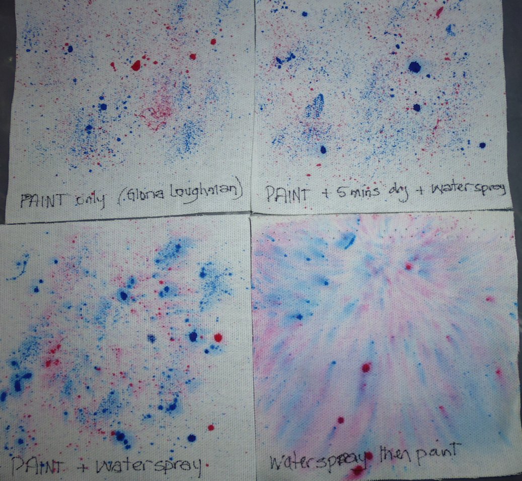
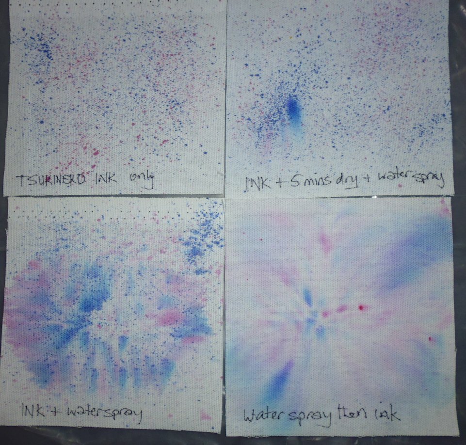
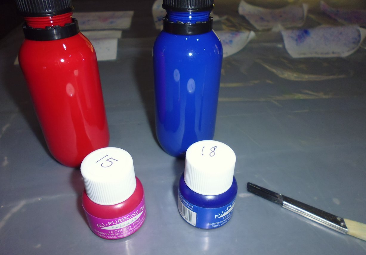
The paints I tested were some I had purchased from a Gloria Loughman workshop some years ago and I don’t know their brand — they have no labels. The inks were Tsukineko All-purpose Inks. I used a small hard-bristled brush (less than 1 cm/half an inch wide) that I’d purchased in the paint aisle at the hardware store (this was NOT an artists’ brush!); the reason I chose this brush was that it gave good resistance in the bristles and spattered the paint in fine droplets. Before starting, I filled a jar with water to rinse the brush, put down a big sheet of plastic, and put on food prep gloves to prevent staining my hands. I also had plenty of paper towels on hand in case of any mishaps.
Swatch results — sky
I decided to spatter blue and red/pink paints/inks for these tests. I was going to just do blue, but wanted to see how the colours would or wouldn’t bleed into each other so I chose a contrasting red/pink to see what would happen. As you can see from the results, adding water (or not) at various stages definitely changes what happens to the paints/inks. I much preferred how the colours rendered on the cream fabric than the green, where they became quite muddy and subdued. After these tests, I decided on the ‘water spray then ink’ technique (but just in blues!) for the main design to emulate a washed out sky.
(click on a photo to see it larger)


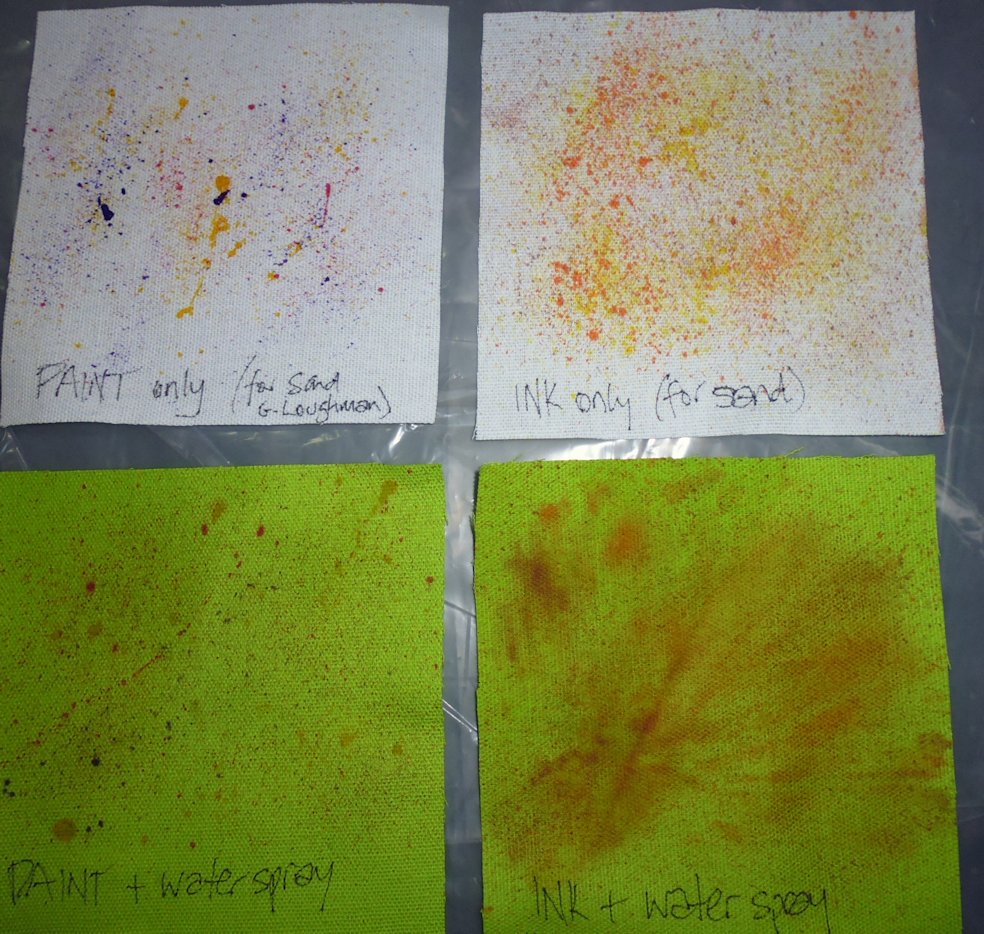
Swatch results — sand
I decided to spatter yellow, red, and purple paints, and brown, orange, and yellow inks for these tests. Again, adding water (or not) definitely changes what happens to the paints/inks. And again, I preferred how the colours rendered on the cream fabric than the green, where they were quite muddy and subdued. After these tests, I decided to use the ‘ink only’ technique for the main design to emulate the sand (but just in brown and yellow as I thought the orange was a bit overpowering).
(click on a photo to see it larger)

Main piece
After deciding on the ‘ink only’ spatter technique for the sand part of the main design, I used baking (parchment) paper and painters’ tape to mask off the upper part of the big piece of fabric I had transferred the main design onto. All well and good, and the paint spattered beautifully (except for a big drop of yellow that fell off the brush! I decided not to try to get it out, instead choosing to wait until I’d finished before figuring out how I’d disguise it…).

Once this lower half had dried (which was almost immediately), I put the baking paper over it and tightly taped down along the horizon edge with painters’ tape. Then I lightly sprayed the top section with water and spattered two different blues over it. I liked the effect, but again, two BIG dollops of blue dropped off the paintbrush onto the main design and spoilt it beyond repair (yes, I’ll have to start again). After ruining the piece with these drops, I waited for it to dry to see how well the masking off worked. Well, it didn’t!
Duck fabric has quite a coarse weave, so the water ignored the painters’ tape and wicked into the lower half of the design, and the blue ink happily followed it down!

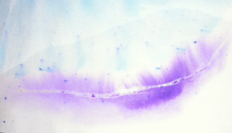
The piece was now completely ruined, but I figured I’d use it for some more experiments. The big issue was how to prevent water wicking/bleeding into areas where I didn’t it to go. Hmmm… what to do? I don’t do fabric dying, so I don’t have any resist mediums (not that I think they’d have worked with this coarse weave anyway). Instead, I decided I’d try two things I did have — a watercolour masking fluid (Frisket), and Elmer’s School Glue. I placed a bead of each on the fabric, waited for them to dry thoroughly, then wet one side of each bead with the water spray and added a bit of ink. And then I waited to see what would happen… Fail!
This first photo is of the watercolour masking fluid — the colour was added BELOW the white masking line in this photo but has totally ignored the ‘barrier’ and bled into the non-wet area. If you look closely, you can see the line of moisture near the top of the photo showing just how far the water wicked past the ‘barrier’, even though the colour didn’t go that far.
This second photo is the result with the Elmer’s School Glue. Again, only the area below the glue line was sprayed with water and colour added to it. And again, it has bled extensively into the non-wet area.

Conclusions
Just using these techniques above (i.e. not buying and testing a fabric resist medium), I came to these conclusions:
- If you’re going to use different techniques (e.g. one with water and one without), then make sure you test BOTH techniques on a SINGLE test swatch BEFORE applying them to the main design!
- Unless you’re using some sort of resist medium that you KNOW works, don’t mix water and non-water techniques on fabrics that will suck up water where you don’t want it to go. There be dragons!
For my next attempt (after I purchase yet another metre of duck fabric and transfer the design), I think I’ll use the ink only technique for both the sand and sky sections, masking each off as I do them. And I’ll apply NO water at all. The backgrounds can all be little spattered dots of colour, and that will have to do.